Learn how using ViewModels can help create great user experiences on ChromeOS

This post originally appeared here.
Supporting ChromeOS devices sounds like a large undertaking with many unknowns. If you didn’t know already, ChromeOS allows users to install Android Apps on their devices. This is great news for ChromeOS users since it unlocks a huge amount of apps that previously weren’t available to them.
Why should you build support for ChromeOS?
ChromeOS support seems like a big task that you may not think is important to implement. But if you do a bit of research into the Chromebook usage, you will see that there is a large portion of the US market that uses Chromebooks. ChromeOS made up 59.6% of mobile computing sales in the US in Q4 of 2017 (according to this article) and whilst in the rest of the world ChromeOS isn’t as popular, it is steadily gaining in popularity. Considering that you can pick up a Chromebook for about $150, you can understand why it might be appealing to purchase.
How to build support in your Android app for ChromeOS?
Spoiler Alert: You don’t need to do anything fancy to enable your Android apps to run on ChromeOS. If your app supports tablets, your app will run on ChromeOS. There are extra options you can consider for a ChromeOS device, such as support for a Stylus and possibly support for if a user doesn’t have a touch screen (If you want them to be able to use your app without one).
Supporting the resizing of layouts can be a bit tricky. If you know what tools to use from the start, building support for this kind of interaction in your apps is something you can do from the beginning of building any new layout or app.
Since releasing the Over App on Android, we’ve been working to optimise our app for ChromeOS devices. But it turns out that we didn’t need to do thatmuch more in order to support it because we were already following best practices (as mostly described in this post). There is obviously room for improvement for us (keyboard shortcut support and UI optimisations). In this article, we will cover how to ensure that your UI remains consistent during app window resizes.
Use ViewModels for storing UI State
If you’ve been out of action in Android for a while, you may have missed all the great libraries that have been released recently that help to solve some complex Android specific issues. ViewModels are a new class available from Android Jetpack.
This is the definition of a ViewModel from the Android Developer docs:
ViewModels help store and manage UI-related data in a lifecycle aware way. The
ViewModelclass allows data to survive configuration changes such as screen rotations.
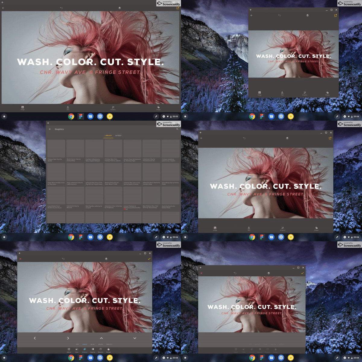
With this definition in mind, this is how ChromeOS handles the lifecycle when resizing an app: It notifies your app of a screen size change, which typically would trigger a new creation of your Activity class. Now if you aren’t using something like a ViewModel, when the new activity is created, you would losethe data that you have backing that view. Since ViewModels have a different lifecycle than an Activity, they outlive a recreation of it.

In our case, we have our layout state stored in the ViewModel and as such, when a user resizes the app window, the state outlives the Activity and the view automatically keeps the same information after it is being resized.
Our ViewModel looks something like this:
class ProjectEditorViewModel : ViewModel() {

    private val _state = MutableLiveData<EditorState>()
    val state: LiveData<EditorState>
        get() = _state

}
The usage of this ViewModel in our ProjectEditorFragment, looks like the code below:
class ProjectEditorFragment : Fragment {

    @Inject
    lateinit var viewModelFactory: ViewModelProvider.Factory

    private lateinit var viewModel: ProjectEditorViewModel


    override fun onCreateView(inflater: LayoutInflater, container: ViewGroup?, savedInstanceState: Bundle?): View? {
        val view = inflater.inflate(R.layout.fragment_editor_initial, container, false)
        AndroidSupportInjection.inject(this)

        return view
    }

    override fun onActivityCreated(savedInstanceState: Bundle?) {
        super.onActivityCreated(savedInstanceState)
        viewModel = ViewModelProviders.of(requireActivity(), viewModelFactory)
            .get(ProjectEditorViewModel::class.java)
        setupViewModel()
    }

    private fun setupViewModel() {
        viewModel.state.observe(this, Observer { editorState ->
            editorState?.let { state ->
                // Set the state of all controls based on the saved state in the ViewModel
            }
        })
    }
}
In the sample above, you can see that we have the ProjectEditorViewModelstate being observed for changes. When a new state comes in from the ViewModel, we will then perform all the required changes in order to update the view’s state.

If we stored our state in a class that wasn’t extending ViewModel or AndroidViewModel, when the activity is resized, the UI information would be lost (i.e. A user’s project changes, the state of the currently selected tool etc.).
With us using ViewModels by default for all our UI state, resizing an activity didn’t present any weird state loss issues. 🎉
Support multiple screen sizes using best practices
Now that we’ve covered how you can go about storing state across window resizing, we might want to transition our layouts in a way that communicates the change in UI. Of course, this is not the only thing you need to do in order to support ChromeOS devices.
There are great guidelines that already exist on how to build for different screen/density size buckets. Follow those in order to support different layout sizes (i.e. Create different size buckets, layout params etc.).
Finally
If you start doing these few things you won’t have to retrospectively go back and change your app to support ChromeOS. The great part about using the suggestions above is that it doesn’t just apply to ChromeOS but also to tablets or phones when you use the split screen feature on any Android device.
There are a few more things you can do to support ChromeOS really well, including supporting a stylus and making sure your app has some delightful keyboard shortcuts. We are getting there!
If you have any questions, feel free to reach out to me on Twitter @riggaroo.
Thanks to Joshua Leibstein and Nick Rout for reviewing this post.
